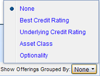
The Show Offerings Grouped By button in the lower right corner of the Search Results graph contains several options that enable you to add a third dimension to your results. View an example?
The default selection is None. Only Yield to Worst and Maturity are represented in the graph.
The table below describes the other available options and shows a sample legend that is added to the graph below the Maturity axis.
| Grouping | Description |
| Best Credit Rating | Each rating ( AAA, AA, BBB, etc.) is represented by a unique color. For example:
|
| Underlying Credit Rating | Each underlying rating is represented by a unique color. For example:
When applying underlying credit ratings:
|
Asset Class |
Each asset class included in the graph is represented by a unique color. For example: |
Optionality |
Callable and non-callable offerings are represented by a unique color. For example:
|